- Performance
- Frontend
Build Like Your User Has Two Bars and a Budget Phone
Your MacBook on office Wi-Fi is lying to you about how fast your app is. A practical guide to testing and building for the conditions most people actually use the web in.
• 5 min read •
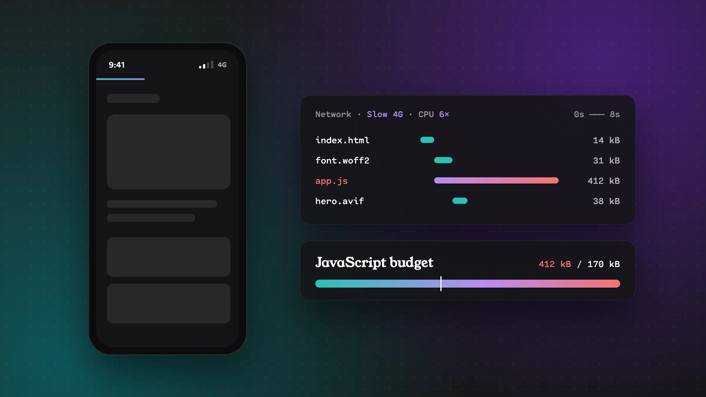
Here’s a confession I think a lot of developers can relate to. For years I tested everything on a powerful laptop, on fast office internet, in the latest Chrome. Everything felt snappy. Ship it!
Then I’d open the same app on a mid-range Android phone, on mobile data, somewhere between Circle and Madina, and wonder who built this slow, janky thing.
It was me. I built it.
If you build for users in Ghana (or honestly, most of the world), your users aren’t on your setup. Many of them are on mid-range or budget Android phones, on mobile data they paid for by the megabyte, with signal that comes and goes. Building for those conditions isn’t an edge case. It’s the main case.
Step one: stop testing on your own machine
You can’t fix what you can’t feel. So the first step is to experience your app the way your users do.
Throttle your network in DevTools. In Chrome DevTools, open the Network tab and change “No throttling” to one of the slower presets. Then reload your app. It’s humbling.
Throttle your CPU too. This is the one people forget. In the Performance tab, set CPU throttling to 4x or 6x slowdown. Budget phones aren’t just on slower networks, they’re much slower at running JavaScript. A bundle that parses in 50ms on your laptop can take far longer on a cheap phone.
Get a real budget phone. Seriously. Buy an inexpensive Android phone and keep it on your desk. Use it to test every feature before shipping. No emulator fully captures what it’s like to tap a button and wait.
Use Lighthouse and WebPageTest. Lighthouse (built into Chrome) gives you a quick score and specific suggestions. WebPageTest lets you test from different locations and devices, and its filmstrip view shows exactly what the user sees, second by second.
JavaScript is the most expensive thing you ship
Byte for byte, JavaScript costs the most. An image just gets decoded and drawn. JavaScript has to be downloaded, parsed, compiled and executed, all on the phone’s limited CPU, often while the user is staring at a page they can’t interact with yet.
Some ways to send less:
Check what you’re actually shipping. Run a bundle analyzer (like rollup-plugin-visualizer for Vite or webpack-bundle-analyzer) and look at the treemap. You’ll probably find a surprise, like a whole date library imported to format one date.
Question every dependency. Before npm install, look the package up on bundlephobia.com and ask whether it’s worth it. Often the browser or a few lines of code can do the job:
// Instead of a date library just to format a date
new Date().toLocaleDateString("en-GH", {
  day: "numeric",
  month: "short",
  year: "numeric",
});
Split your code. Don’t make someone download the settings page JavaScript when they’re only looking at the home screen. Most frameworks support lazy loading routes and heavy components:
const ReportsChart = lazy(() => import("./ReportsChart"));Render on the server where you can. Server-rendered HTML shows content before any JavaScript runs. Frameworks like Astro (which this blog uses), Next.js and Remix make this the default. A page that needs zero JS to show its main content is incredibly resilient.
Images: the easiest big win
Images are usually the biggest bytes on a page, and the easiest to fix.
Use modern formats. WebP and AVIF are often dramatically smaller than JPEG and PNG at the same visual quality. Most frameworks and image CDNs can convert automatically.
Serve the right size. Don’t send a 2000px-wide photo to a phone that displays it at 400px. Use srcset so the browser picks:
<img
  src="photo-800.webp"
  srcset="photo-400.webp 400w, photo-800.webp 800w, photo-1600.webp 1600w"
  sizes="(min-width: 768px) 50vw, 100vw"
  alt="Description of the photo"
  width="800"
  height="600"
  loading="lazy"
/>
Lazy load below the fold. loading="lazy" tells the browser not to download images until they’re about to scroll into view. One attribute, potentially a lot of data saved. (Don’t lazy load your main hero image though. You want that ASAP.)
Always set width and height. This lets the browser reserve the space before the image loads, so the page doesn’t jump around as images pop in.
Watch your fonts
Custom fonts are lovely, but each weight and style is a separate download. A design using three font families in four weights each can mean a dozen font files.
- Use fewer weights. Do you really need light, regular, medium, semibold and bold?
- Use
font-display: swapso text shows immediately in a fallback font instead of staying invisible while the custom font loads. - Consider system fonts for body text. They’re already on the device and cost zero bytes.
Design for flaky connections, not just slow ones
Slow is one problem. Unreliable is another. Connections drop in elevators, in traffic, when someone walks to the back of the office. Your app should handle that gracefully:
Never lose user input. If a form submission fails because the connection dropped, keep everything they typed and offer a retry. Losing someone’s carefully typed message is one of the fastest ways to lose their trust.
Set timeouts. By default, fetch will wait a very long time. Give up after a reasonable time and show a helpful message:
const response = await fetch("/api/data", {
  signal: AbortSignal.timeout(10000), // give up after 10 seconds
});
Show cached data while refreshing. Showing the last known balance or feed, clearly marked as “last updated 2 minutes ago,” is far better than a spinner. Libraries like TanStack Query handle this pattern well.
Make retrying easy. A clear “Try again” button beats making people reload the whole page.
Respect people’s data
For a lot of users, data costs real money. A few ways to be respectful of that:
- Don’t autoplay video. Let people choose to play it.
- Avoid giant background videos on landing pages.
- Be careful with prefetching. Preloading pages people might visit makes things faster on Wi-Fi but burns data on mobile.
- Check the Save-Data hint where it’s available. Some browsers can send a
Save-Dataheader or exposenavigator.connection.saveDatawhen the user has turned on a data-saver mode. Support varies (it’s mainly Chromium), so treat it as a bonus signal, not something to rely on.
Set a budget and stick to it
The trouble with performance is that it erodes slowly. Nobody adds 500KB of JavaScript at once. It’s 20KB here, 30KB there, every sprint.
A performance budget puts a number on it:
- Total JavaScript under X KB (compressed)
- Largest Contentful Paint under 2.5 seconds on a throttled mobile profile
- Total page weight under Y MB
Then check it in CI, so a pull request that blows the budget gets flagged before it ships. Tools like Lighthouse CI or size-limit make this straightforward.
Wrapping up
Building for slow networks and budget phones isn’t about lowering the bar. It’s about building something that works beautifully for the people who actually use it.
And here’s the nice part: everything that makes your app fast on a budget phone makes it even faster on a flagship. Nobody has ever complained that a site loaded too quickly.
So this week, throttle your DevTools, grab the cheapest phone in the office, and try your app. Then fix the first thing that annoys you. Your users will feel the difference, even if they never know why.