- CSS
- Frontend
Modern CSS That Lets You Delete JavaScript
Modals, tooltips, responsive cards, form validation styles. Things we used to need JavaScript for that CSS and HTML now handle on their own.
• 4 min read •
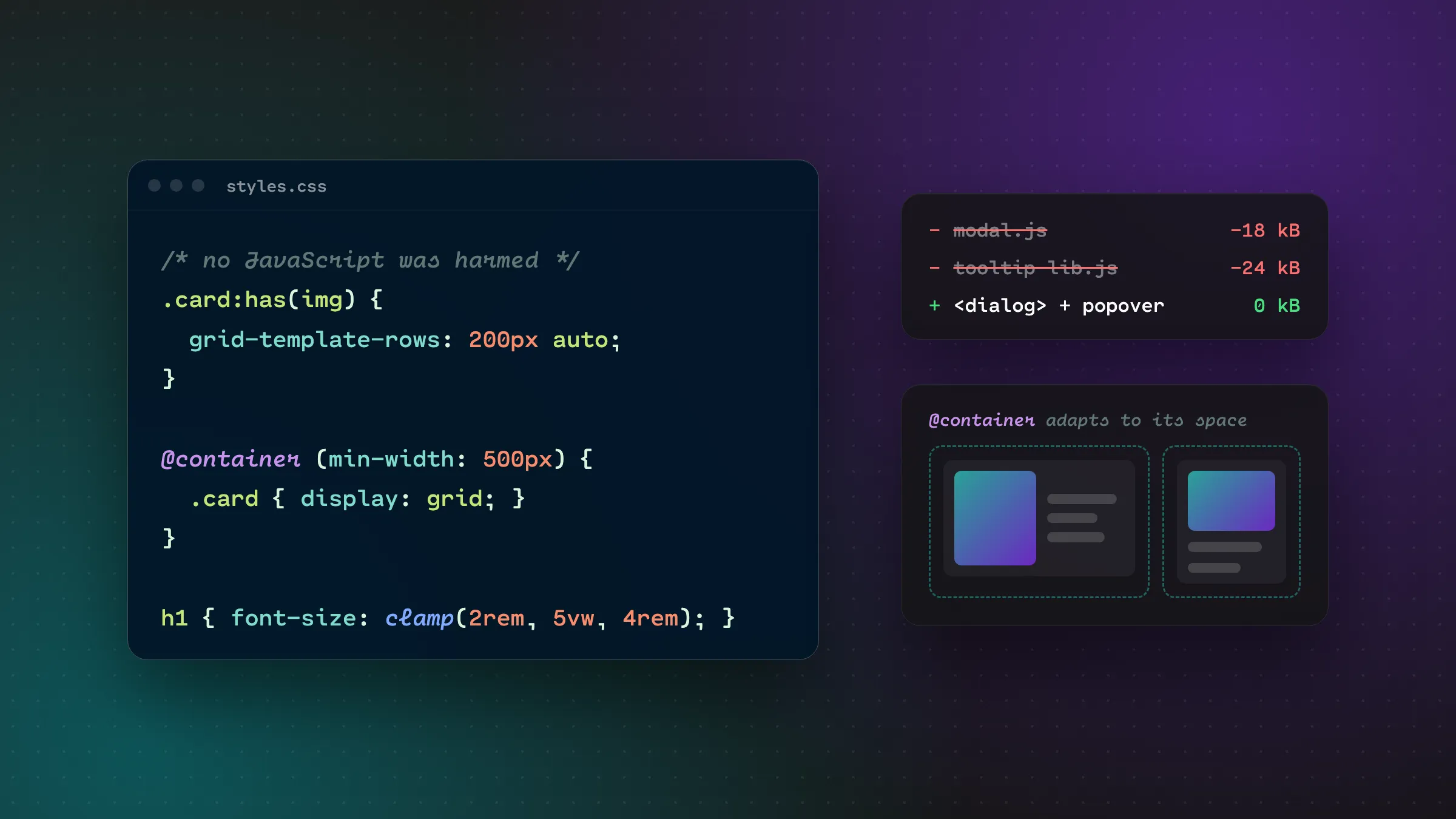
For years, the answer to “how do I make this UI do X?” was usually “add some JavaScript.” Need a modal? JS. Style a card differently when it has an image? JS. A tooltip that doesn’t get cut off? Definitely JS, plus a library.
That’s changed a lot. CSS and HTML have quietly gained features that replace a whole category of JavaScript. Less JS means smaller bundles, fewer bugs, and things that keep working even if a script fails to load.
Here are the ones I reach for most. All of them work in current versions of Chrome, Edge, Firefox and Safari, but always check caniuse.com against the browsers your users actually have.
:has(), the parent selector we waited forever for
For most of CSS’s life, you could style a child based on its parent but never the other way around. :has() changes that, and it’s honestly a little mind-bending at first.
Style a card differently if it contains an image:
.card:has(img) {
  grid-template-rows: 200px auto;
}
Highlight a form field’s wrapper when the input inside is invalid:
.field:has(input:user-invalid) {
  border-color: var(--color-feedback-danger);
}(:user-invalid is a nice bonus here. Unlike :invalid, it only kicks in after the user has interacted with the field, so the form doesn’t show errors before anyone’s typed anything.)
Prevent the page from scrolling while a modal is open:
body:has(dialog[open]) {
  overflow: hidden;
}
Every one of those used to be a JavaScript class toggle.
Container queries: components that know their own size
Media queries ask “how wide is the screen?” But a component doesn’t care about the screen. It cares about how much space it has. A card in a narrow sidebar and the same card in a wide main column should probably look different, even on the same screen.
Container queries make that possible:
.card-wrapper {
  container-type: inline-size;
}

.card {
  display: grid;
  gap: 1rem;
}

/* When the card's container is at least 500px wide */
@container (min-width: 500px) {
  .card {
    grid-template-columns: 200px 1fr;
  }
}
Now you can drop the card anywhere and it adapts on its own. For design systems this is huge, because components finally become truly portable.
<dialog>: modals without the headache
Building an accessible modal from scratch is surprisingly hard. You need to trap focus, close on Escape, put it above everything else, add a backdrop, and return focus to the button that opened it.
The native <dialog> element handles most of that for you:
<button type="button" id="open">Delete account</button>

<dialog id="confirm">
  <h2>Delete your account?</h2>
  <p>This can't be undone.</p>
  <form method="dialog">
    <button value="cancel">Cancel</button>
    <button value="confirm">Yes, delete it</button>
  </form>
</dialog>

<script>
  document.getElementById("open").addEventListener("click", () => {
    document.getElementById("confirm").showModal();
  });
</script>
With showModal() you get Escape-to-close, focus moved into the dialog, the rest of the page made inert, and a stylable backdrop:
dialog::backdrop {
  background: rgb(0 0 0 / 0.6);
  backdrop-filter: blur(4px);
}
And that <form method="dialog"> trick closes the dialog when any button inside is clicked, no event handlers required.
The popover attribute: menus and tooltips with zero JS
For things that aren’t full modals, like dropdown menus, info panels and toasts, there’s the popover attribute. This one requires no JavaScript at all:
<button popovertarget="menu">Options</button>

<div id="menu" popover>
  <a href="/settings">Settings</a>
  <a href="/logout">Log out</a>
</div>
Click the button and the menu opens. Click outside or press Escape and it closes. It renders in the “top layer,” so you’ll never fight z-index or overflow: hidden clipping again.
clamp(): fluid sizing without breakpoint soup
Instead of setting a font size at three different breakpoints, let it scale smoothly:
h1 {
  /* min, preferred, max */
  font-size: clamp(2rem, 1.2rem + 2.5vw, 3.5rem);
}

.section {
  padding-block: clamp(3rem, 8vw, 8rem);
}
It works for anything with a size: font sizes, padding, gaps, widths. Fewer media queries, smoother results.
text-wrap: balance: no more lonely words
You know when a heading wraps and leaves one sad little word on its own line? One line fixes it:
h1, h2, h3 {
  text-wrap: balance;
}
The browser evens out the line lengths so headings look intentionally set. It’s a tiny thing that makes a site look noticeably more polished.
A few more small wins
accent-color themes native checkboxes, radios and range sliders with one line, no custom components needed:
:root { accent-color: #00a0a8; }aspect-ratio replaces the old padding-top hack for responsive videos and images:
.video { aspect-ratio: 16 / 9; width: 100%; }scroll-margin-top stops a sticky header from covering headings when you jump to an anchor link:
h2 { scroll-margin-top: 6rem; }inset is shorthand for top, right, bottom and left:
.overlay { position: absolute; inset: 0; }Should you rip out all your JavaScript?
No. JavaScript is still the right tool for plenty of things: complex state, data fetching, rich interactions. And if a meaningful slice of your users are on older browsers, you’ll need fallbacks.
But it’s worth a fresh look at your codebase. Every time you see a useState that only exists to toggle a CSS class, or a library pulled in just to position a tooltip, ask: could the platform handle this now?
More and more, the answer is yes. And code you don’t write is code you never have to debug.