- Forms
- UX
- Accessibility
Designing Forms People Don't Hate
Forms are where users actually give you money, data and trust. A field-by-field guide to making them faster, friendlier and far less annoying, with the HTML to back it up.
• 5 min read •
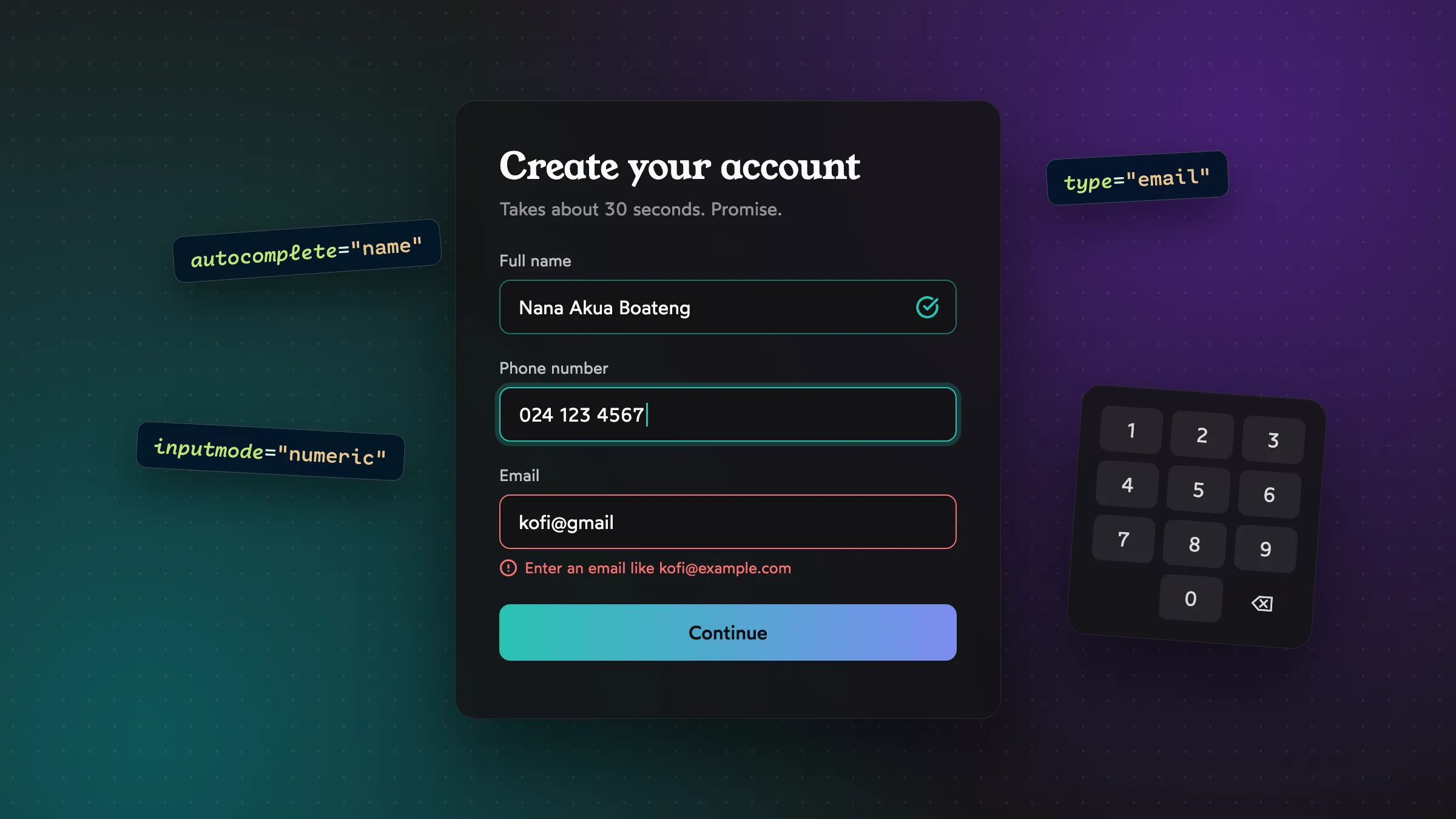
Nobody has ever opened an app and thought, “I can’t wait to fill in a form.”
But forms are where the important stuff happens. Signing up. Checking out. Sending money. Booking an appointment. If your form is annoying, it doesn’t matter how beautiful the rest of your product is. People bail right at the finish line.
The good news is that most form frustration comes from a handful of very fixable mistakes. Let’s go through them.
Labels go above the field. Always.
I know placeholder-only inputs look clean in a mockup. Here’s the problem: the moment you start typing, the “label” vanishes. Now you’re halfway through a long form wondering, “Wait, was this field asking for my first name or my full name?”
<!-- Looks minimal, works badly -->
<input type="text" placeholder="Full name" />

<!-- Slightly less minimal, works great -->
<label for="name">Full name</label>
<input id="name" type="text" autocomplete="name" />
Labels above the field are also the easiest to scan on mobile, where there’s no room for labels on the left anyway.
Use placeholders for examples if you like (“e.g. 024 123 4567”), never as the label.
Let the browser do the heavy lifting
HTML has a bunch of built-in superpowers that most forms ignore. Three attributes do a huge amount of work:
type changes validation and the mobile keyboard:
<input type="email" />  <!-- @ key on the keyboard -->
<input type="tel" />    <!-- number pad -->
<input type="url" />    <!-- .com and / keys -->
inputmode gives you the right keyboard without changing the input type. It’s perfect for things like PINs and amounts:
<!-- Numeric keypad, but still a text field (keeps leading zeros) -->
<input type="text" inputmode="numeric" autocomplete="one-time-code" />

<!-- Keypad with a decimal point, for amounts -->
<input type="text" inputmode="decimal" />
autocomplete lets the browser and password managers fill things in for the user:
<input autocomplete="given-name" />
<input autocomplete="email" />
<input autocomplete="tel" />
<input autocomplete="new-password" />
<input autocomplete="one-time-code" />
That last one is a gem. On many phones, one-time-code lets the OS suggest the OTP from an incoming SMS right above the keyboard. One tap instead of switching apps, memorizing six digits and switching back.
A form with good autocomplete values can go from “two minutes of typing” to “three taps.” It’s the cheapest UX win there is.
Don’t fight people over formatting
Think about phone numbers here in Ghana. People might type any of these:
0241234567024 123 4567+233 24 123 4567233241234567
They’re all the same number. Rejecting three of them with “Invalid phone number” is the form being lazy and making the user do the work.
Instead, accept it loosely and clean it up yourself:
function normalizeGhanaPhone(input) {
  const digits = input.replace(/\D/g, ""); // strip spaces, dashes, +
  if (digits.startsWith("233")) return "0" + digits.slice(3);
  return digits;
}

normalizeGhanaPhone("+233 24 123 4567"); // "0241234567"
Same idea for card numbers, dates, amounts with commas. Let people type the way that’s natural to them, then normalize behind the scenes.
Validate at the right moment
Timing is everything with validation. Get it wrong and the form feels like it’s nagging you.
Too early: Showing “Invalid email” the instant someone types the first letter. They haven’t finished yet! This is like someone correcting your sentence while you’re still speaking.
Too late: Only showing errors after they hit Submit on a 12-field form, then scrolling them back to the top with a red wall of text.
Just right: Validate when the user leaves the field (on blur). Then, once a field is showing an error, re-check it as they type, so the error disappears the moment they fix it.
That combination feels helpful rather than pushy. And it’s very satisfying to watch an error disappear as you correct it.
Write errors that actually help
Compare these:
- Don't:“Invalid input”
- Don't:“Error: field validation failed”
- Do:“Enter your phone number, like 024 123 4567”
- Do:“Password needs at least 8 characters. You’ve got 6.”
A good error message says what’s wrong and how to fix it, in plain language. No blame, no jargon, no ALL CAPS.
And make sure errors are connected to their field for screen readers:
<label for="phone">Phone number</label>
<input
  id="phone"
  type="tel"
  aria-invalid="true"
  aria-describedby="phone-error"
/>
<p id="phone-error">Enter your phone number, like 024 123 4567</p>
Now when a screen reader user lands on the field, they hear the error too.
Please don’t disable the submit button
It’s a really common pattern: grey out “Submit” until the form is valid. It feels tidy. In practice, it’s frustrating. The user taps the button, nothing happens, and they have no idea why.
Keep the button enabled. When they tap it with something missing, show them exactly what’s missing and move focus to the first problem. They learn what to fix instead of guessing.
The one time you should disable it: right after they tap, while the request is in flight, so nobody double-charges themselves.
Ask for less
Every field you add costs you some people. Before adding one, ask: do we actually need this right now?
- Do you need their address at sign-up, or only when they place an order?
- Do you need “Confirm email”? (Most people just copy-paste anyway.)
- Do you need a separate first and last name? Plenty of names don’t split neatly that way.
If a field is optional, consider whether it should be there at all. And if most fields are required, mark the few optional ones with “(optional)” rather than plastering asterisks everywhere.
Never lose what they typed
This is the cardinal sin. Someone fills in a long form, the network hiccups, the page reloads, and everything’s gone. They will not fill it in again.
- If submission fails, keep the data in the form and show the error.
- For long forms, consider saving a draft to
localStorageas they go. - Never clear a password field and the rest of the form just because the password was wrong.
One column, one direction
Multi-column forms look efficient but make the eye zig-zag, and people miss fields. A single column, top to bottom, is easier to scan and works the same on every screen size.
The exception is short, related fields that people naturally think of together, like expiry month and year on a card.
A quick form checklist
Wrapping up
Great forms are mostly invisible. People zip through them without thinking, and that’s the goal. You won’t get compliments for a well-designed form, but you’ll see it in your conversion numbers and your support inbox.
Pick one form in your product this week. Fill it in on your phone, with one thumb, on a bumpy trotro ride. You’ll find something to fix. I promise.