- Performance
- UX
- React
Your Spinner Is Lying: Designing Honest Loading States
Spinners, skeletons, optimistic updates and progress bars each tell users something different. Here's how to pick the right one, and the timing tricks that make an app feel fast.
• 5 min read •
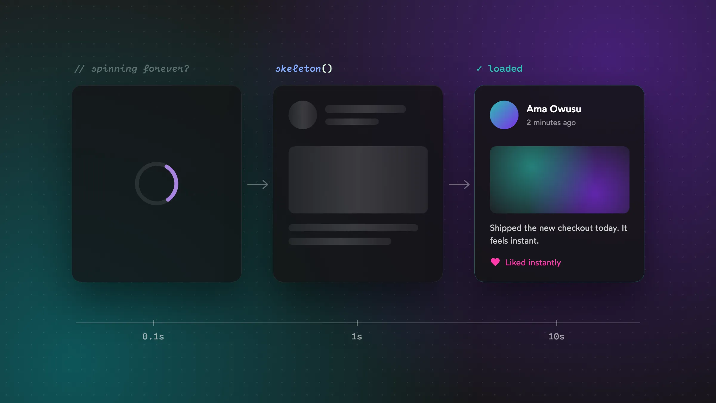
Here’s a fun experiment. Open your app, click around, and pay attention to only the loading states. The spinners, the blank screens, the flashes of content.
It’s usually a bit rough, isn’t it?
Loading states are one of those things that rarely get designed properly. They’re an afterthought, a spinner dropped in at the last minute. But users spend a surprising amount of time looking at them, and they have a huge effect on whether your app feels fast.
Notice I said feels. That’s the whole game here.
Perceived speed beats actual speed
Two apps can take exactly the same time to load data, and one can feel twice as fast. The difference is what you show while people wait.
There’s a classic set of response-time thresholds that Nielsen Norman Group has written about for decades, and it’s still a great mental model:
- Under ~0.1 seconds: feels instant. No loading indicator needed.
- Under ~1 second: the user notices the delay but stays in flow. A subtle indicator is fine.
- Up to ~10 seconds: attention starts to drift. They need clear feedback that something’s happening.
- Over ~10 seconds: they’ll likely switch tasks. Show progress and let them do something else.
Each bucket calls for a different kind of loading state. Let’s go through the toolbox.
Tool 1: Don’t show anything (yet)
This one surprises people. If a request usually comes back in 150ms, showing a spinner for it makes things worse. The spinner flashes on and off so fast it looks like a glitch, and it draws attention to a wait that would otherwise go unnoticed.
The fix is to delay the loading indicator. Only show it if the request takes longer than about 300ms:
import { useEffect, useState } from "react";

function useDelayedFlag(active, delay = 300) {
  const [show, setShow] = useState(false);

  useEffect(() => {
    if (!active) {
      setShow(false);
      return;
    }
    const timer = setTimeout(() => setShow(true), delay);
    return () => clearTimeout(timer);
  }, [active, delay]);

  return show;
}

// Usage
const showSpinner = useDelayedFlag(isLoading);
Fast requests now feel instant. Slow requests still get feedback.
There’s a flip side: once you do show a spinner, keep it up for at least ~400–500ms, even if the data arrives sooner. Otherwise you get a jarring flash. Delay before showing, minimum time once shown. Those two numbers make loading feel calm instead of flickery.
Tool 2: Skeleton screens
Skeletons are the grey placeholder blocks shaped like the content that’s coming. They work well for content-heavy pages like feeds, dashboards and profiles because they do two things a spinner can’t:
- They show the shape of what’s coming, so the page feels like it’s already partly there.
- They prevent layout shift. When the real content arrives it slots into the same space instead of pushing everything around.
A few rules to make them work:
- Match the real layout closely. A skeleton that looks nothing like the final content just creates a different kind of jump.
- Keep the shimmer subtle. A gentle pulse is enough. A strobe-light effect is distracting.
- Don’t skeleton everything. Static stuff like headers, navigation and labels you already know should render immediately. Only skeleton the parts that are actually loading.
.skeleton {
  background: hsl(0 0% 20%);
  border-radius: 6px;
  animation: pulse 1.5s ease-in-out infinite;
}

@keyframes pulse {
  50% { opacity: 0.5; }
}
Tool 3: Optimistic UI
This is my favorite, and it’s the closest thing to magic in frontend development.
When a user does something that almost always succeeds, like liking a post, ticking a to-do or renaming a file, update the UI immediately, before the server responds. Then quietly sync in the background.
async function toggleLike(post) {
  const previous = post.liked;

  // 1. Update the UI right away
  setLiked(!previous);

  try {
    // 2. Tell the server
    await api.toggleLike(post.id);
  } catch {
    // 3. Roll back if it failed, and tell the user
    setLiked(previous);
    toast.error("Couldn't save that. Please try again.");
  }
}
The app now feels instant no matter how slow the network is. The rare failure gets handled gracefully.
But be careful where you use it. Optimistic UI is great for low-stakes, reversible actions. It’s a terrible idea for anything involving money. Never show “Payment sent ✓” before the server has actually confirmed it. For payments, transfers and bookings, honesty beats speed every time.
Tool 4: Progress indicators for long tasks
For anything that takes more than a few seconds (uploading a file, generating a report, processing a big import) a spinner isn’t enough. A spinner says “something’s happening.” It doesn’t say “almost done” or “this will take a while.”
If you can measure progress, show it:
- Determinate progress bar (a percentage) when you know how much is left, like uploads.
- Step indicators when the process has clear stages: “Uploading… Processing… Almost done…”
- Time estimates for long jobs, even rough ones: “This usually takes about a minute.”
And for really long tasks, let people leave. “We’ll notify you when your report is ready” is much kinder than holding someone hostage on a loading screen.
Tool 5: Buttons that show their own state
When someone taps “Save,” the feedback should happen right there on the button. Not in a spinner in some corner of the screen.
<button type="submit" disabled={saving} aria-busy={saving}>
  {saving ? <Spinner aria-hidden="true" /> : null}
  {saving ? "Saving…" : "Save changes"}
</button>
Two small details that make this feel polished:
- Disable the button while it’s working so people can’t double-submit.
- Keep the button’s width stable. If “Save changes” becomes “Saving…” and the button shrinks, everything around it jumps. Set a
min-widthor keep the text the same length.
Don’t forget the sad path
Loading has three possible endings, not one: success, empty and error. Plenty of apps design the success case beautifully and leave the others as an afterthought.
- Empty: “No transactions yet” with a hint about what to do next beats a blank white box.
- Error: Say what went wrong in plain words and always give a way out, usually a “Try again” button.
- Timeout: If a request has been going for 30 seconds, it’s probably not coming back. Stop spinning and tell the user.
A spinner that spins forever is the most dishonest loading state of all.
A cheat sheet
| Situation | Use |
|---|---|
| Fast request (< 300ms) | Nothing; delay the indicator |
| Loading a page of content | Skeleton screen |
| Low-stakes action (like, toggle) | Optimistic UI with rollback |
| Money, bookings, irreversible actions | Honest loading state; wait for the server |
| Long task with measurable progress | Progress bar or steps |
| Very long task | Background it and notify later |
| Button action | Inline button loading state |
Wrapping up
Loading states are where your app communicates with users while it’s busy. A good one says: “I heard you, I’m working on it, here’s roughly how long.” A bad one just spins and hopes.
Next time you add a spinner, pause and ask: what does the user actually need to know right now? The answer is usually more interesting than a spinning circle.